 Every book needs a title page. Whether it’s in a printed book or an ebook, the title page shows the official title, author, and publisher that will go into the Library of Congress database—or the equivalent database in your country.
Also, it’s supposed to be the first, or almost the first, page that a reader sees. As such, it has the potential to set the tone for the rest of the book, and with a good design, add marketing value.
So here are some ideas, starting with the basics.
Required elements for a title page
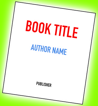
You must include the following, in this order:
- Book title
- Book subtitle, if any
- Edition, unless it’s the first edition. This can appear either above or below the title (and subtitle).
- Book author(s)
- Book publisher or publisher’s imprint. Some self-publishers don’t have these.
A few more title page elements
You may add the following elements as well, if you wish:
- Author’s affiliation (graduate degrees and/or university), if relevant to the topic
- Publisher’s location
- Publisher’s logo (sometimes called a colophon)
- Illustration(s) or graphics
- A frontispiece, which is an image that appears opposite the title page
And that’s it. This is not the place for marketing blurbs, quotes from inside the book, or anything else that will add clutter. Even children’s picture books, with illustrations everywhere, must abide by these rules.
But now that we’ve set out the rules—or maybe we should call them guidelines—let’s discover what folks really do.
Adult trade book title pages
These are the title page designs that you’re probably most familiar with. Just a few examples will suffice, but you’ll note a couple of minor variations on the guidelines.

The image facing the title page in the photography book is called a frontispiece. And in case you’re wondering, the colorful title page of our book above is in the ebook version.
These are fine for novels and nonfiction, and not much more is needed or expected. Let’s move on to adult books with higher design ambitions.
Some suggestions for getting creative with your book's title page. https://tinyurl.com/mp854mvz Share on XCoffee table book title pages
The title page or spread in a coffee table book should draw the reader in and prepare them for the wonderful views in the rest of the book. Check out the creative designs below.

There are so many ways to use the title spread space. The top spread has a sort of spilled-over frontispiece. The middle one fits the type in between ghosted versions of the book’s featured images. And in the bottom spread, what better place to put a big title than up in the sky? (All designs by Peter Blaiwas of Wordesign Publishing Services.)
In some cases, the illustrations show something that appears later in the book, as in the middle example above. Sometimes the image is unique to the title page and is described in a caption on the copyright page.
Children’s picture book title pages
Here’s where the fun really begins. Variations are endless, but all of the required elements are included in every case. The number of book pages is limited, with 32 or 48 being the norm. Usually there’s not enough space to devote an entire page to the copyright, so it is often tucked into the left side of the title page spread, or on the final page or back cover or even the jacket.


In each case above, the designer and the artist worked together to leave relatively blank areas for the type.
With a board book, the page count is usually 16 or 24, including the cover. These limits require some creative thinking about where to locate both the title page and the copyright notice. Sometimes the front cover acts as the title page, as shown below.

The front cover is the title page in these books. Including the covers, The Peter Rabbit Pop-up Book has 16 pages and Peek-a-Who has 24. In these two books, the copyright notice is tucked away either on the reverse side of the front cover or on the back cover.
Experimenting with the design
In all the books shown above, the title, author, and other elements are nicely balanced on the page or spread. Sometimes before you begin to design the page or spread, the empty space can seem intimidating. And sometimes there’s almost nowhere to fit the type in. (If this happens, ask your illustrator to create space for you.) Either way, use type, colors, and perhaps graphics or images from the overall book design—both the cover and the interior—so the page will lead harmoniously from the cover into the rest of the book.
We hope these examples will inspire you to do the most with your title page!
Read more: Book endpapers: A gallery of ideas » More real estate for your wonderful images!
And more: Design a children’s picture book » From cover to cover
And even more: Your copyright page » The other required page for every book
Plus a bonus: Creative copyright notices » Ideas for designing that very important page
Book Design Made Simple. You can do it yourself.


Hi,
It is indeed sad to see that ‘Book Design Made Simple’ is closing soon. It has been my reference and guide for 2 books that I have complied/written. I am in the midst of another now.
I would go as far as to say that your site has been my source of inspiration. Thank you for all the hard work that you have put in and most of all your willingness to share your knowledge and skill with designers and writers all over the world.
Will there be an archive of your blogs that we can refer to?
Once again a BIG thank you and wish you the very best in all your future endeavors.
Cheers!!
Krishnaraj, thanks for your kind words. We’re so glad that our blog inspired you, and we’ll consider whether an archive of our blogs is feasible. We wish you all the best!
Fiona and Glenna
Krishnaraj, great news! Hadley Hendrix, our book design colleague, has created an archive of all our blog posts on her Substack “Hadley House.” You can find all of our blog posts here: https://hadleyhouse.substack.com/s/book-design-made-simple-archives. Enjoy!
Thank you for this clear breakdown! I love how you balance essential rules with creative flair. For writers seeking extra support, services like The Legacy Ghost Writers can help ensure the title page and the entire book meets industry standards while reflecting personal style.
Does your paperback book include ePub/eBook/Kindle export from InDesign? Just curious! It seems that everyone who does a book with me wants to include the digital version as well as the paperback version. Thanks!
Hello Lynne,
We included one short chapter at the end of the paperback that discusses ebook conversion. We figured that the methods change so often, and that since we are not experts in it, we shouldn’t try to explain the technique(s). For our book, we hired professionals to produce each electronic version, but that included a lot of oversight, constant checking, and decision-making on our part.
We suggest that you find a service that you can rely on for conversions. After all, making an ebook is a completely different exercise from designing a book. With that in mind, though, in our paperback we do note the factors that you should keep in mind as you design and lay out the printed book.
If you want to get into the business of ebook conversion yourself, we congratulate you and wish you the best of luck!
Glenna and Fiona
Thank you. There is not so much stuff online about e-book design and self-publishing. Keep up the awesome work!
Thanks, Alessandro!