 Book endpapers (also called endsheets) are probably the least noticed part of a hardcover book. But the endpapers are literally what hold the pages and the cover together. And they can add value to your book if you use them well.
If you’re publishing a paperback, take a look at the examples in this article for ideas anyway; you’ll find that the same principles can apply.
The function of endpapers

In our previous article about book binding, we showed how a casebound (hardcover) book is held together. Here’s the illustration that shows the parts.
You can see that without the endpapers, the whole thing would fall apart, so every casebound book has them. At the front and the back of the book, the endpaper page that is not glued down is called the flyleaf. Three endpaper pages are visible—and usable—at the front and also at the back, for a total of six.
But what about perfect bound (paperback) books, you might ask? No endpapers are needed to hold them together. But you can simply use the inside front and back covers plus the first and last pages to make spreads that imitate endpapers. It can be just as effective.
Most of the time, the endpapers are plain white and simply not noticeable. This is certainly the least expensive choice, and there’s nothing wrong with it. But let’s discuss using color.
Add color
Your printer will offer you a choice of colored paper stock for your endsheets. If you plan well, you can find a color that perfectly matches your book cover. Or a color that contrasts handsomely. A book with a brown cover could have red endpapers; a pink cover could have clashing orange or red or blue ones; a black cover could have orange ones. You get the idea. Look through the samples you’re shown and think creatively.
Use endpapers to add value
Reference books, especially, can use endpapers to great effect. Here’s an atlas with a world map that serves as a visual table of contents on the front, and world time zones on the back.


This detail shows the very useful visual table of contents in the atlas above. Each rectangle notes the page number that displays that area. (Hammond World Atlas, 3rd edition)
Easy-to-find reference material is a huge bonus for the reader. Could you use this space to help your readers? Think maps, a pronunciation guide, a list of characters or a family tree, a timeline . . . .
How could you add just that little bit to your #book to put it over the top? We suggest delightful endpapers. #selfpublishing #indieauthors https://bit.ly/3w0Bfr1 Share on XNow how about this cookbook for a plant-based, gluten-free diet? Before even opening to page 1, you might be convinced to buy the book and give the recipes a try, based on the enticing photos:
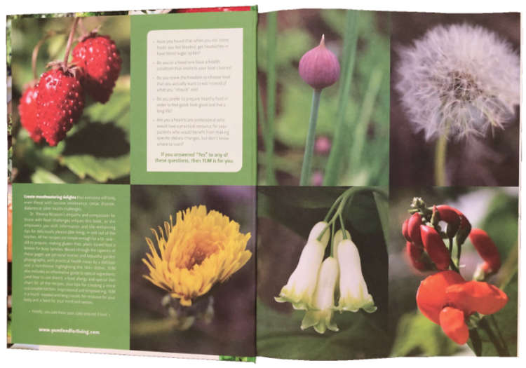
(YUM: Plant-based recipes for a gluten-free diet by Theresa Nicassio, PhD. Design by Mauve Pagé)
Here’s another case of endpapers drawing the reader into the book. The spectacularly dramatic photograph of a car crash is full of action:
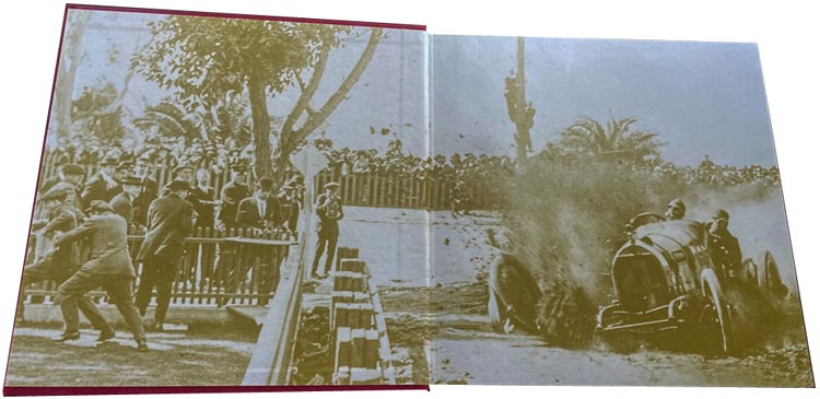
(Classic Speedsters by Ronald Sieber of Steering Wheel Press. Design by Nathan W. Moehlmann. Read more about the making of this book on our Readers’ Books page.)
Add interest or whimsy
In this book called 1421: The Year China Discovered America by Gavin Menzies (first edition), the enormous ship on the endpapers is a constant reminder of the size of the vessels in the Chinese fleet that sailed around the world in 1421–1423. (Notice the European ship on the lower left.)
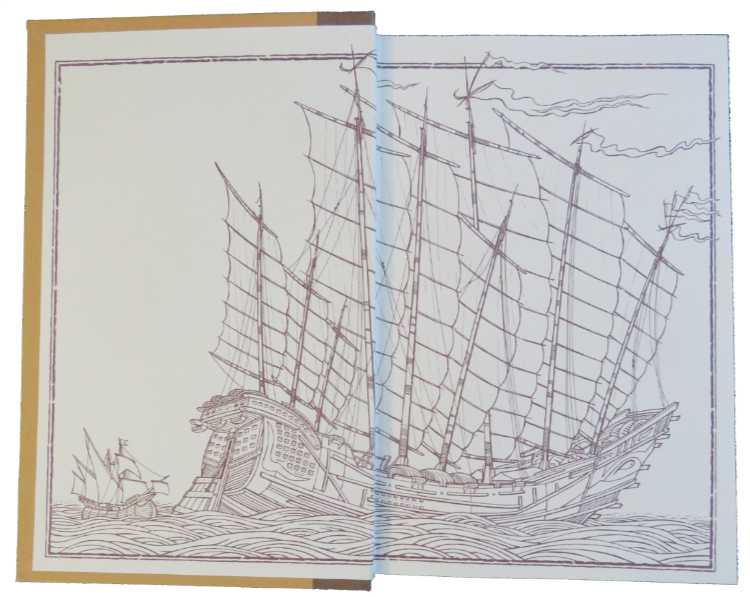
(Illustration by Neil Gower)
Every year, a professional publishing association called Bookbuilders of Boston puts on the New England Book Show. This 2014 book of winners uses a lot of B’s on the endpapers, just for fun.


Detail from the book above. (57th Annual New England Book Show 2014. Design team: Framingham State University Graphic Design students)
Children’s books often make great use of the endpapers. Penciled spirals! What could be more whimsical?

(The Book of Wrong Answers by Penny Noyce, illustrated by Diego Chaves)
And how about this immediately recognizable scene from Mark Twain’s Tom Sawyer? It simply adds fun and appeal.
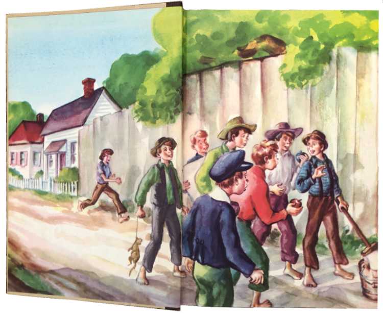
(1946 Illustrated Junior Library edition, illustrated by Donald McKay)
The endpapers in this book called One Plastic Bag by Isatou Ceesay and the Recycling Women of The Gambia add a kind of horrifying beauty:

Add content
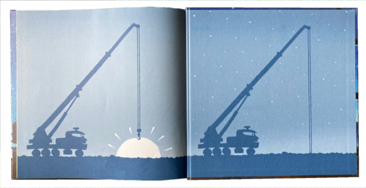
Many children’s books use the endpapers to extend the story or the lesson. In the beloved Goodnight, Goodnight, Construction Site by Sherri Duskey Rinker and Tom Lichtenheld, a crane lowers the sun gradually in the four endpaper illustrations. Here are the final two stages of sunset:
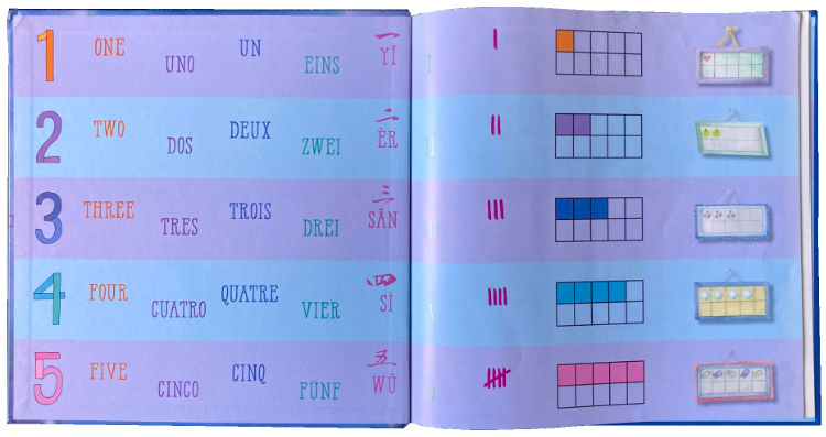
In Goodnight, Numbers by Danica McKellar, the lesson is extended on both pairs of endpapers.
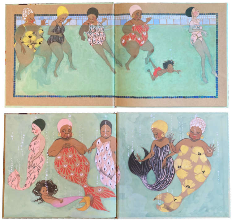
In Julián Is a Mermaid, Jessica Love uses every conceivable surface to enhance this imaginative story: the jacket, the hard cover, and, of course, the endpapers, which serve as a visual prologue and epilogue.
Finally, you must see the endpapers in This Is What Democracy Looked Like, written and designed by Alicia Lin Cheng. The book shows a vast array of election ballots that have been used throughout US history. The author noticed the frequent and imaginative use of type ornaments in the nineteenth and early twentieth centuries and probably couldn’t resist playing with them. This is one of the very few books we know of that uses all available sides of the endpapers on both front and back, for a total of six different designs.


Detail of the image above. Each of the six available pages of endpapers in this book has a different pattern of type ornaments.
We hope this little display will help you think of creative ways to use the endpapers in your book.
Read more: Design a children’s picture book » The rest of the book is important, too!
Read more: Creative copyright notices » presents another gallery of great ideas.
And even more: Designing a book spine » demonstrates an additional way to add value to your book.
Book Design Made Simple. You can do it yourself.


Thanks for this, Glenna and Fiona! It has charmed and delighted my day!
I totally agree that endpapers should be exploited. In the case of my book, Classic Speedsters (2021), my book designer placed a classic high-definition photo of a racing car losing its wheel at “Death Curve” in 1914. In it you see three photographers bravely capturing the moment while people all around them scurry away from the disintegrating wooden wheel on the race car. The driver is bravely fighting for control as his car is about to crash. The photographer who captured this immortalized a moment.
All of this two-page spread was printed on the endpapers, both front and back of the book. Totally Wow!
Ronald,
Your endpapers sound amazing. Thanks for sharing.
Glenna