 Some InDesign functions have names that you would never be able to guess, and that makes them really tough to discover and learn. One of these is Optical Margin Alignment (I’m calling it OMA), which is InDesign’s formal name for hanging punctuation. I used to see this effect in other people’s work and then try to imitate it, but I couldn’t because I had no idea what it was called. So this article explains what it is and how to do it.
What optical margin alignment looks like
Optical margin alignment (hanging punctuation) allows you to show quotation marks, bullets, and hyphens outside the normal text area—a bit similar to a hanging indent. Take a look at the left sides of these two text blocks:
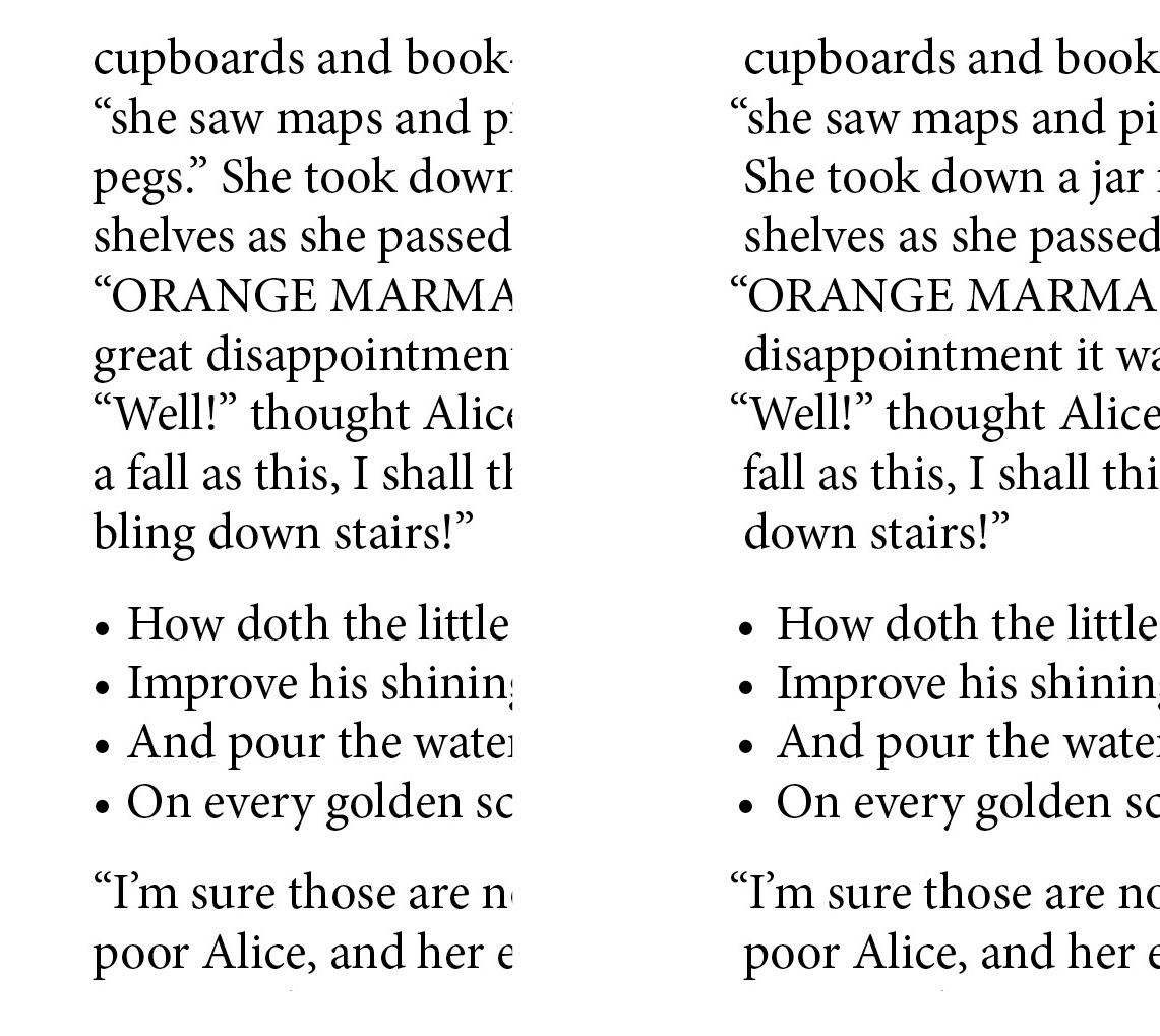
The sample on the left is typeset conventionally, with no optical margin alignment. In the right sample, OMA is in use. Notice that the quotation marks and bullets stick out just a bit to the left of the hard, actual margin.
The optical margin is the imaginary line that your eye sees at the left and right edges of the text. (In InDesign, of course, margins and text frames can easily be made visible by simply pressing “w” while nothing is selected.) Some people notice that bullets and quotation marks placed exactly at the left edge make the type appear misaligned. Ditto with hyphens on the right edge. And so it was that hanging punctuation began with the Gutenberg Bible, where you can see large initial letters hanging out on the left and hyphens jutting out to the right of the columns. So if you want to try it, you are in good company. Continue reading.
Make your #typesetting look more sophisticated with #InDesign's optical margin alignment (hanging punctuation). It's easy! https://goo.gl/WPktfk Share on XHow to produce optical margin alignment
The method is simple.
- Put your cursor anywhere in the story. (A story is all the text—no matter how much or how little—that is threaded together.)
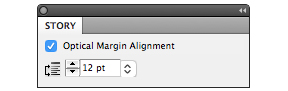
- Go to Type>Story, and click in the Optical Margin Alignment check box.
- Choose a value. The most moderate, least noticeable value is probably the one that’s the same size as your leading, but go ahead and try other size options till you find the one you like best.
And you’re already almost finished.
Now you’ll notice that every single item in your book (or the current story) that could possibly use OMA is now using it, and this may not be what you intended. Maybe the bullets or numbers in lists are now sticking out too much to the left and bothering you. Or maybe a chapter title starts with a quotation mark and is now looking a little out of alignment. To undo the OMA, simply go into the paragraph style for any element where you want to stop using it. In Indents and Spacing, check Ignore Optical Margin.

If you are not using OMA at all in your document, you may completely ignore the Ignore Optical Margin box. InDesign’s default mode is not to use it, so just leave it unchecked throughout.
We hope this short article has helped you learn a new typography term and add something a little more sophisticated to your skill set. Now that you know about it, you’ll start seeing it everywhere.
Read more: Typesetting math in InDesign »
Read more: Making tables look good in InDesign »
Watch a video tutorial: Typesetting a poetry book »
Book Design Made Simple. You can do it yourself.


When using Optical Margin Alignment, should that always match your font size? For example, I’m using 11pt. Should the OMA be 11?
Hello Karen,
Optical Margin Alignment is normally the same size as the leading you’re using, not the type size. But you should experiment to see if you prefer another size.
Glenna and Fiona
Thanks for some more good information! And congrats on your blog!
M & L
Glad you enjoyed our blog post!
This is a great reminder! Thanks Fiona and Glenna!
Glad you enjoyed our blog post!
Thank you Glenna! It is something I found out on my own, but it is great to have someone put it in words!
Hi Marie,
I never did find this myself but learned it from Fiona. Lucky me to have a wonderful co-author. I hope you have great success with your new website.
Glenna