 Do you use a layout grid? A few months ago, I saw a survey on Twitter for designers. The one multiple choice question went something like this:
- I always use a layout grid.
- I sometimes use a layout grid.
- What’s a layout grid?
I had to laugh, but then I began thinking that some of our readers could benefit from learning about this topic.
Just to be clear, I’m not referring to a baseline grid here, but to a layout (or page or typographic) grid. Here are a few examples of blank book spreads with grids.

The grid lines shown here do not actually appear on the book pages. The InDesign user can see them, though, and use them as guides for laying out the page.
This rather long article is divided into the following sections. Feel free to follow your interests.
- Reasons to use a layout grid
- Verticals (columns) in a layout grid
- Horizontals in a layout grid
- Some examples of layout grids in real books
- How to construct a layout grid in InDesign
- Further reading
 Reasons to use a layout grid
 Grids have been around ever since the beginning of books, even handwritten ones. Think of a grid as an invisible frame that holds the letters neatly in place. Once movable type was invented in the West, the individual metal (or wood) letters needed to be held together on the press with a strong metal frame.
So grids give pages structure, but as you’ll soon see, they also give the designer license to get creative.
Verticals (columns) in a layout grid
The columns in your layout grid are indispensable, even if there’s only one of them. All of the margins hold the text in place like a frame and often make up the bulk of the white (or negative) space on the page. The amount of space between columns (column gutter) determines ease of reading, but also adds to the white space. (Designers always think about negative space; it’s part of the fun of the job.)
Below you can see a firm column grid that allows different widths of text on the same spread. Notice how the white space is used to emphasize certain areas of text.

You can decide to use a grid that uses mainly verticals; this gives you almost total flexibility for illustration sizes. Or you can use one that includes horizontals also.
Horizontals in a layout grid
Add horizontal lines to your layout grid if you want a more controlled look. A grid with both verticals and horizontals is called a modular grid.
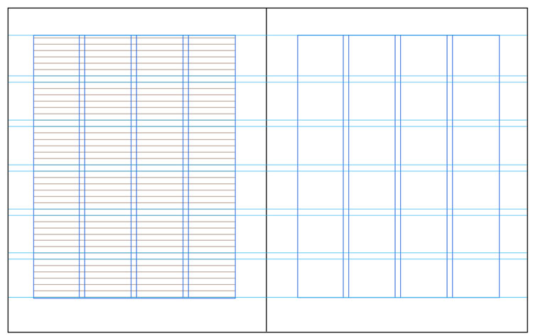
Any modular grid, like the one above, should use the baseline grid (shown in brown on the verso page) to assist in breaking up the vertical space into equal sections. In this case there are 6 vertical divisions with 7 lines of text in each. Images will be cropped to fill one or more modules. In addition, captions can be aligned to the grid, either below or to the side of images. To achieve a neat modular grid like this, you will probably have to fiddle with your leading and/or margins to achieve a line count per page that will divide evenly.
The only practical drawback to this kind of grid is that images must fit nicely in the modules. You might have to use some awkward cropping to make this happen, so if your images show original artworks, you could get into trouble. Museums and artists do not normally allow cropping of images without written permission.
Some examples of layout grids in real books
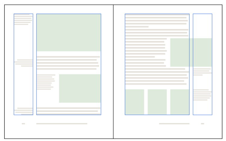
Here are some ways to use a layout grid. All of the examples below are from real books. Dark blue and red lines show the column(s) and other grid lines, all of which are of course invisible to the reader. Light green blocks represent images.
This is the grid we used in Book Design Made Simple. It is based on 4 columns, with 3 lumped together and used for text and 1 for captions—but with flexibility. (We demonstrate how to do this in a video and in our book, see Setting up a page layout with uneven columns.) Design by Fiona Raven.

This strict 2-column grid (above) in Res magazine (an art and anthropology journal) forces most images into the width of a single column. Horizontal grid lines here would be unworkable because most illustrations are of original artworks and cannot be cropped at random to fit inside such a grid. This 1981 design by Dan Flavin and Richard Bartlett worked wonderfully for 35 years.

The compound grid for Photography: The Whole Story (edited by Juliet Hacking) looks dizzying at first glance. But it’s actually very clever and allows all sorts and sizes of material to fit into the space. Notice, for instance, that the large upper left photo is 5 red columns wide and the caption for it is 1 blue column wide. Meanwhile, the main text uses 4 columns of the red grid. On the recto page, the upper right image uses the red grid while the lower ones use the blue. The 6-column area below the cyan horizontal guides is used on many spreads for a timeline marching across the bottom. Design by Quintessence. Please don’t try a layout grid like this on your first book!

The book above (Made for Walking by Julie Campoli) has a layout grid that is not based on equal column widths. The emphasis is on the height of the large photos at the top, which are equal throughout the book. Cyan horizontal guide lines are used on pages with the large photos, which sometimes bleed and sometimes do not, but which always stop at that upper guide. Design by Peter Blaiwas.
How to construct a layout grid in InDesign
Before you begin devising a grid for your design, consider the nature of the book you’re working on. Make a list of all the kinds of elements in the manuscript: sidebars, extracts, illustrations of all kinds, poetry, tables, various levels of headings, footnotes, etc. How complex is this book? Do you need multiple columns? Do you think you’re going to be squeezed for space? Will you have (or do you want) plenty of white space? Any problem solving you can do at this early stage will help you later on.
If you have any preconceived ideas about how you might like to design this book, now is the time to drop them! Please, please don’t try to squeeze a book into an unsuitable design just for the sake of expressing something that’s in your head. (After a decades-long career, I still have designs I’d like to use but have not found the right project to use them on!) The design must match the content of the book.
When you start a new file in InDesign, you are immediately asked to choose your trim size (usually dictated by practical matters such as standard trim sizes or conventions of your book’s genre), define the number of columns plus the space between them, and set your margins (the grid’s outer frame). Often it is difficult to come up with suitable values to put in the dialog boxes. If you have trouble, try one of these tricks:
- Set all margins to 0, then add some text on a blank spread and manipulate the text frame until you find a shape and placement that you like. Then go back to File > Document Setup and add the values for the margins. You can always fine tune them later. (Highlight both parent (previously called master) pages in the Pages panel, then go to Layout > Margins and Columns. This is fully explained in chapter 20 of Book Design Made Simple and shown in our YouTube video.)
- Trim 2 pieces of paper to the trim size of your book and put them together like a 2-page spread. Sketch margins and text blocks with a pencil until you’re satisfied. Do some measuring, then start your new InDesign document.
Next, you can start placing guides to define your layout grid. In Book Design Made Simple, we show you one method to achieve a one-column main text block with a narrow side text block for captions, definitions, illustrations, etc. Read about this layout grid method here: Setting up a page layout with uneven columns.
Try out your margins and grid with some live material and experiment until you get something workable. Remember, you want your layout grid to be firm but flexible so that all the parts relate to the whole within a structure of your own design.
For further reading
Many, many words have been written on the topic of the golden section (or golden ratio or golden canon) and also layout grids. (In this article, I’ve ignored the golden dimensions for the sake of simplicity.) For more information, start with these three books:
Grid Systems by Kimberly Elam. Princeton Architectural Press, 2004. A thorough how-to guide to grid systems with helpful translucent overlays to help the reader envision the grids.
Layout Grid Calculator is an online tool to help you devise the perfect grid for your book’s trim size. One page covers multicolumn grids, another does modular grids, and a third calculates the golden ratio.
Making and Breaking the Grid by Timothy Samara, Second Edition. The Quarto Group, 2017. Innumerable examples of increasing complexity. Some emphasis given, as the title implies, to breaking the grid.
Thinking with Type by Ellen Lupton, Third Edition. Princeton Architectural Press, 2024. A large section of this excellent book is devoted to the grid. The author breaks through the complexities and gets right to the point.
Read more: Baseline grid essentials for book design » explains why and how to use a baseline grid.
And more: Basic principles of book design » reveals the three main ideas to keep in mind in just about all fields of design.
And watch: Changing your trim size » shows how you can change your page size and margins to make your layout grid work better.
Book Design Made Simple. You can do it yourself.


Thanks for the great article on grids!
Linda, glad you enjoyed the article!
Intriguing!
Nina, you might find a simple grid helpful when laying out pages for your books with images.