 In Book Design Made Simple, we mention cookbooks a few times but never sit you down and explain in detail how to go about designing one. Once you’ve had some experience with designing and laying out other books, you’ll see at once that you’ll need to apply some extra effort to make a good-looking, readable cookbook.
So how will you design your cookbook? Well, the answer depends on what elements it has. Certainly you’ll have a title, an ingredient list, and instructions for each recipe. What about photos or illustrations? Do you have cooking hints that could be considered sidebars? And how long are the recipes? Most likely there’s a big variation in length.
In this blog post I’ll use three common cookbook trim sizes as examples, point out the features of each, and offer some hints on achieving the best fit for your recipes.
But before we proceed with design, I’m going to beg you to have your recipes professionally edited. It’s very difficult to get recipes to conform to a single style, especially if you’ve obtained them from various sources—your relatives, your own experiments, and from printed or online materials. In order to make the collection yours, you must make them all consistent. Even the ingredient lists can get out of hand without the strong will of an editor bending them into shape. So please don’t skip this vital step. And take a few hints from T. Susan Chang, who reviews cookbooks for a living, in this Publishers Weekly article. Very revealing.
All right, now let’s start the design discussion with an analysis of your materials. Make a list of every kind of element in your book. If your instructions are numbered, consider them to be numbered lists. On the other hand, your instructions might be more like narrative text, probably with many short paragraphs. Do you list the number of servings somewhere? Perhaps you use photos for some but not all of your recipes. Making this list will help you organize your thoughts.
Now locate your longest list of ingredients, and your longest set of instructions. Plus your longest sidebar, if you have any. Combine all of these into one big fat fake recipe and see how it fits onto a book page for each of the trim sizes discussed below. Remember to leave plenty of thumb space at the base of the page, a wide enough inside margin for comfort, and some more white space here and there for cooks to write notes to themselves. This exercise will help you decide which trim size will work best for your book.
Setting up your cookbook page layout
 To save time and frustration, I suggest that you not begin by placing all of your text onto your pages, even though this is the suggested method in Book Design Made Simple. Instead, design first and lay out later by following this procedure:
- Experiment with various trim sizes (see below), layouts, and typefaces until you find a combination that will fit your recipes nicely. Remember to stick with printers’ standard trim sizes (Book Design Made Simple, pp. 20–21).
- Make a parent (previously called master) page spread with a separate text frame for each element: recipe title, introduction, ingredients, instructions, and perhaps a sidebar. If you’re going to use illustrations, make object frames for them, too.
- Now thread the empty text frames (see p. 49) on the verso page together in the order of appearance, and repeat on the recto page. Next, thread the last element on the verso page to the first element on the recto page. (Be careful not to thread any frames for illustrations by mistake.)
- In the Pages panel, make sure that your book’s first page of recipes uses a recipe parent (master) page, then add one more recipe page.
- Activate the first text frame on the first recipe page (Ctrl/Cmd+Shift+click), get the Type tool (Ctrl/Cmd+T), put the cursor in that first text frame, and Place the file that contains the manuscript (Ctrl/Cmd+D). Your recipes should then flow onto as many pages as you need. (See p. 48 for Autoflow.)
- If you are planning one page or spread per recipe, go through the pages and force frame breaks (Type>Insert Break Character>Insert Frame Break) within each page, and page breaks (Type>Insert Break Character>Insert Page Break) where needed. Keyboard shortcuts for the breaks are available on a numeric keypad (but most likely not available on a laptop computer):
- Column break: Enter
- Frame break: Shift+Enter
- Page break: Ctrl/Cmd+Enter
- Add paragraph and character styles to the type (chapters 10, 11), then squeeze, stretch, move, or delete text frames as needed for each recipe. Add your illustrations and sidebar backgrounds.
Naturally, if your book has part and chapter openers, you’ll insert those where needed. Get design ideas from Book Design Made Simple (chapter 24) or from other cookbooks.
Smallest and simplest trim size
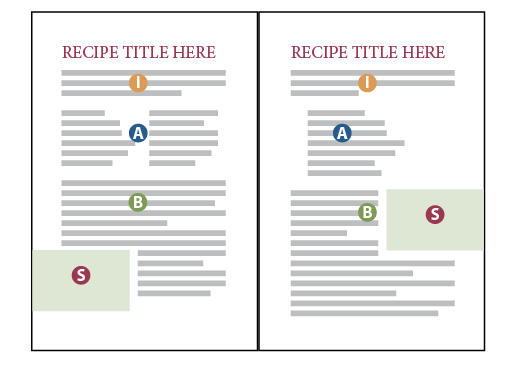
 The smallest trim size we’ll discuss here is 6 x 9 inches. Use this if your recipes are all fairly similar in structure and you don’t require large illustrations. You’ll set up parent (master) pages with a text frame at the top for the recipe title and introduction (I). Then a 1- or 2-column frame for the ingredients (A), and a 1-column frame for the instructions (B). If you have sidebars (S), you might consider letting them bleed on the outside of the page to break up the page a bit and make them easy to find if you refer readers to them later.
If you want to add small illustrations (called spot art), you could put them in the same place each time (just above or below the title, next to the ingredients, or inside the sidebar, for instance). Or you could use the spot art sparingly, only when you have space to fill or for a particular instructive purpose.
Naturally you may deviate from the suggested layout below in any way you like. Put the introductory material in the sidebar. Center the recipe titles. Get ideas from other cookbooks, too. As long as your recipes follow the basic formula and look like recipes, you may do as you please.
Pleasing trim size for more complex layouts
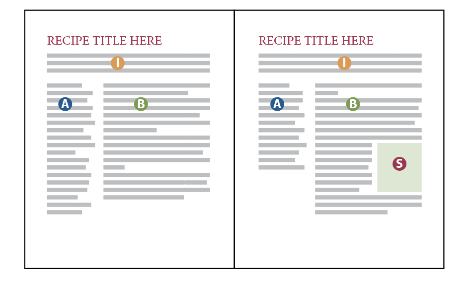
A nice, medium trim size for a cookbook is 7.5 x 9.25 inches. (Check to make sure your printer offers this as a standard size—most do, but not all.) Books of this size are comfortable to hold and allow for generous margins and enough space to add photos.
Below is one suggested layout. Once again, your parent (master) pages will have a text frame at the top for the recipe title and introduction (I). Then a 1-column text frame on the left for the ingredients (A), and a frame on the right for the instructions (B). Sidebars (S) can appear anywhere, depending on the content and available space.
In Book Design Made Simple we describe how to set up a grid where the main text column is 2 or 3 columns wide (but all in one column) and the narrow column is 1 column wide (page 126). You may attempt to achieve this symmetry, or even try another combination such as 3 and 2 columns, but it’s likely that your recipes will not fit in this nice, neat way. If not, simply make the columns the correct width to accommodate your longest ingredient list and your longest set of instructions, and leave a comfortable amount of space (0.25 in. or more) between them.
Below is another suggestion for the 7.5 x 9.25” trim size. This design is quite similar to the 6 x 9” design shown above, but there’s more space for everything, including white space for the cook’s notes and a more generous inside margin, which helps when the book does not lie open as well as you might like.

You can use a spread for an extra long recipe. Simply begin it on the verso page and continue onto the recto. You might fill any leftover space with a large photo, a description of a cooking method, or even a quote from a famous chef or from literature.
If you have a number of 2-page recipes, plan the book so that the 2-pagers end up on spreads rather than beginning on a recto and continuing to a verso. This might involve shuffling recipes a bit, but it’s entirely worth the extra effort to achieve a great look. Some cooks may be attracted to a recipe and start it with enthusiasm, only to be dismayed to find out later that it continues onto the next page!
The biggest trim size
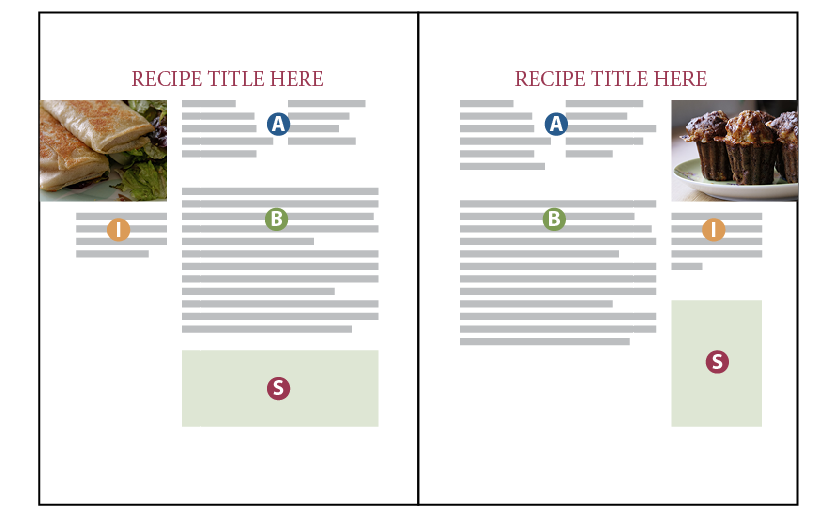
For a quick and easily printed (or even photocopied) recipe book that you might want to send to your family or use for a fundraiser, consider an 8.5 x 11” trim size. It could be GBC (Cerlox) bound, spiral bound, or something else (see p. 408). This size allows for all kinds of extras and large photos.
This first design is a variation on the preceding ones in this article. Notice all the white space! Leaving white space makes the recipes look more doable. Work with this concept until you find the best way to fill the pages comfortably.
Perhaps your cookbook is more like an encyclopedia, with hundreds of recipes and few frills. Notice how much more you could fit by using a two-column design like the one below. Does this somehow remind you of The Joy of Cooking?

For a book design like this, it’s nice to begin as many recipes as possible at the top of a column, and to accomplish that you will need to leave some columns short. Also, add elements such as sidebars and illustrations to fill space and to avoid placing a recipe title at the bottom of a column. You can see above how efficiently the space is used. This design is great for a really big recipe collection, and it saves paper, too.
Typesetting hints for cookbooks
Cookbooks are in a category of their own when it comes to typesetting, and some of the normal conventions don’t apply. Please heed the following:
- In your ingredients lists, make sure that fractions are readable without a magnifying glass. (Consider asking one of your older potential readers how clearly they can see the numbers.) Set them in a larger size if necessary (and make a character style for them). To make well-formed fractions, see page 351 of Book Design Made Simple.
- Be consistent with your layout. Place the number of servings in the same spot each time, for instance. Always number the steps, or don’t number any of them. Add headings above the lists for different parts of the ingredients lists, such as “Cake” and “Icing.” Your editor will have helped you with this.
- “Ragged bottom” layout is perfectly acceptable. Don’t try to align columns and pages at the bottom of a spread.
- Using a normal baseline grid (chapter 23) might not work for your cookbook. Try a baseline grid that is half of the leading size; for instance, if your type is 11/14, make the grid 7 points (half of the leading). That way, you’ll have some structure but not enough to force large spaces where you don’t want them.
Ready, set, go!
By studying as many cookbooks as possible and using the suggestions above, you’ll be able to find the perfect direction for your own book of recipes. Set up pre-threaded parent (master) pages, then place your text on the first page, and before you know it your book will begin to take shape. Have fun with it—you’re on a delicious journey!
Read more: Combining serif and sans serif fonts » will help you spice up your design with confidence.
Read more: Using a layout grid in InDesign » will help you organize your cookbook design and layout.
Book Design Made Simple. You can do it yourself.


I have been reading posts regarding this topic and this post is one of the most interesting and informative one I have read. Thank you for this!
Thanks for your kind words, Eleanor!
Fiona
The two column design might be the best option for what I am looking to do. I am thinking of putting together a large cookbook for fundraising, so there will be many recopies in it. The two column will ensure that it isn’t too many pages.
Hi Shaylee,
I just love those fundraiser cookbooks, usually more for the recipes than for the design. If you use two columns for yours, the result could be terrific. I hope you’ll have a really good index; the best ones have ingredients as entries, such as Cauliflower (and then all the recipes with cauliflower in them listed below). Good luck with your book and the fundraising!
Glenna