 Want to design a workbook? Who uses those any more?
Lots of folks, actually. Even though there are apps for practically everything these days, children still enjoy workbooks for mazes or drawing or learning practically anything. Adults can use them for recording their latest bird find or geocaching location, or for word or number puzzles, for instance. A coloring book can be considered a workbook, too.
We’ll help you design a workbook that will work well for your audience.
I’m going to break the process down into small chunks because there are many decisions to make as you proceed with your design. If you’re looking for a specific aspect of how to design a workbook, use the list below to jump to that section.
A workbook might be the best medium for engaging your readers and getting them learning! We explain how to make it look great. https://bit.ly/32708Fq Share on X Workbook printing, binding, and trim size
Perhaps this seems backwards, but we always consider printing and binding first because they affect everything else.
IngramSpark is no longer printing new “low content” books, which are books with mostly white space on the pages. (They will print most workbooks, though.) But don’t worry; KDP (Amazon) is still printing them, and there are lots of other book printers out there—see below for a specialized list. Look for appropriate paper stock, and consider perforations or use a spiral binding. Use uncoated paper for writing on, and choose an appropriate weight (thickness) from their paper samples. Ask for advice especially if you plan to perforate your pages. And consider using recycled or what’s called “sustainable” paper for this project.
Binding and margins
Consider the possibilities. Aside from regular paperback (perfect) binding, you could use:
- Spiral binding
- Wire-o, which is similar to spiral but the wires are paired and perpendicular to the spine rather than at an angle
- Perfect binding with perforations
- Saddle stitch for a book of 48 pages or less, though this page count varies by printer
Why is the binding important to think about at this stage? Because when you design a workbook, you should always keep the user’s comfort in mind. No one likes a book that keeps slamming shut when they’re trying to write in it. And who enjoys cramming their answers into a tiny space next to the binding?
So ask your printer how much space will be needed to accommodate spiral binding or perforations (usually up to ½”), and keep those areas completely clear of any images or type. Then, aside from those allowances, leave plenty of space for a left- or right-handed person to write in your book. Experiment with a pencil on your own to determine the best inside margin to use.
And while you’re at it, don’t forget to leave space in the outer margin also for users to write their own notes, if appropriate. Also allow a big enough margin at the bottom of the page so readers’ hands don’t always fall off the bottom while they are writing. (This is annoying too, right?)
Below is a short list of “coloring book” printers to get you started, though of course you could print a workbook with them also. Their paper stocks vary, so remember to take that into consideration when you make your decision. (We have not used any of these printers, so this is not an endorsement.)
- Printing Center USA for spiral, wire-o, perfect binding, or saddle stitch
- PS Print for saddle stitch
- BookBaby for perfect binding
Trim size
In North America, almost all workbooks are letter size (8.5 × 11″). But if you have different needs, simply use whatever size will work.
Workbook design: the pages
 As usual, there are a lot of things to think about and try before settling on a workable page design.
Colors
Most workbooks are printed with black ink only, but sometimes you also need a teacher’s edition with answers. Answers are typically printed in cyan (blue). Naturally, two-color printing is more expensive, so instead you could use [square brackets] with bold or italic type—or a different typeface—to make answers stand out for the instructor, while using only one color of ink.
Or go with 4-color printing throughout if you like!
Margins
I mentioned these above. Be generous.
Text design
Workbooks are relatively informal, so feel free to use ragged right (left justified) text if you want. Don’t worry about making all the pages the same length. You will probably have to be very flexible about spacing between lines and between paragraphs, so don’t bother to use a baseline grid. Perhaps this sounds as if it’s going to be easier than usual to design! But you must still stay within your margins while keeping related material together—one page per lesson is the most common format—especially if you expect readers to tear pages out.
Type size and style
The type size depends entirely on your audience. For adults, use a size that is readable, but don’t make the lines too long. Five inches (30 picas) is about as wide as a reader can tolerate while still being able to find their way to the next line, unless you leave extra space between the lines (leading). To keep within this limit but also save space on the page, consider a two-column format.
For children, not only the size but also the typeface makes a big difference. Depending on the age of the child, use between 14 and 24 point type for reading, and even larger for copying or tracing.
In English, the letters we read do not necessarily look much like the letters we write. The most obvious examples are the letters a and g, which we usually read like this:
![]()
But write like this:
![]()
If your workbook teaches children how to write, carefully consider which typeface to use. Here are three examples of penmanship fonts, below. To look for others, go to an online font shop and use the keywords “penmanship,” “primary,” or “infant.” Some of these typeface families include a dotted font that kids can trace over. You might also have some luck with free fonts that imitate children’s handwriting. Use the typeface that most closely resembles the style used in your area.


Above: Sassoon Infant. Below: KG Primary Penmanship and KG Primary Italics. You might notice that in these fonts, the capital letters are the same height as the ascenders; this is almost never the case with regular type, where ascenders are typically taller than capitals.
This advice goes for other writing systems also, such as Japanese, Hebrew, Arabic, or Chinese. Many fonts are available!
Write-on lines
Do you need a Name line at the top of each page? What about a space for a date or classroom or something else? In order to keep these the same on every page (and make your life easier), place them on a parent (master) page. For the write-on line itself, simply use an underscore. In fact, use underscores for all simple, single write-on lines throughout your book.

One way to make underlines extend to the right margin easily is to set up a tab in your paragraph style.
To make the ends of all the lines line up neatly on the right (if you are stacking a few), hit Enter/Return at the end of each line and use Full justify alignment. Another way is to set up a paragraph style for lines or paragraphs that need underscores that reach to the right margin. In your paragraph style, set up a right tab at the right margin. Then when you get to the spot where you want the underscore to start, leave a word space (if there’s type on that line), and simply hit the Tab key to make the line extend automatically.
Make sure that the leading in paragraphs with underlines is large enough so people can write on the lines.
Do you need triple write-on lines for beginning writers of a Roman alphabet language? First draw your top and bottom rules to the width of your type area, using the Pen tool. Then for the middle dashed rule, try one of these two methods:
 1. Use a preset dashed rule in InDesign. Use the Pen tool to make your center line. Select it, then in the Stroke panel, simply choose Dashed (4 and 4) in the Type options list (see right). Consider making this rule either thinner or 50% black, as shown below.
Space the three rules so one is at the baseline, one is at the top of the lowercase ascenders, and the middle one is at the top of the x-height (the height of the lowercase x) of the font you’re using. Now group the 3 rules (Ctrl/Cmd+G) and put the group into an InDesign library so you can grab it whenever you need it. Here’s what it might look like:

Use a thinner center rule (left) or make it thicker but 50% black (right). You’ll find that thinner rules have shorter dashes than thicker ones.
To make the whole group narrower sometimes, simply select the group, click on the central handle at the right end, and push it to the left. The individual dashes in the middle rule will retain their original width.
2. Draw your own middle rule in InDesign. If you don’t like the look of the example above, experiment until you find just the right length for each dash of the x-height rule. Copy it, and paste it in place. Then move it to the right by holding down the right arrow key until you like the amount of white space between the dashes. Repeat this until you have enough dashes to fill an entire line in your book.

Click on the Distribute horizontal centers icon (long and short hotdogs on sticks) under the Align tab.
If the spaces between the dashes look uneven, select all of them, go the Object & Layout panel > Align > Distribute Objects, and click on the “Distribute horizontal centers” icon (see right) to make them evenly spaced.
You can make the x-height rule thinner or a shade of gray. Group all the rules together (Ctrl/Cmd+G) and put them into an InDesign library for future use.
Here are a couple of possible examples:

Your center rule could have wider dashes with less space (left) or narrower dashes with more space (right), or anything you like, if you make them yourself.
To make your write-on line group less wide, first ungroup it (CtrlCmd+Shift+G). Select the top and bottom rules and drag the center right handle to the left until you find the right length. Then delete any of the dashed lines that are now sticking out on the right. Select the dash at the right end of the remaining ones and move it to align with the right end of the top and bottom rules. Then select all of the dashed lines and click on the “Distribute horizontal centers” icon again to neaten things up. Group them all back together.
Workbook front matter
A title page is optional; you might want to start your workbook pages right away on page 1.
A copyright page is not essential, either, but you should include at least a copyright notice somewhere. Some placement options are: behind the title page (if you have one), on the inside front cover, on the back cover, or right on the title page (as a last resort). For info on what to include in your copyright notice, see our copyright article and template.
Since libraries are not usually interested in workbooks, you don’t need CIP data.
And here’s a thought: If your workbook pages will be perforated or spiral bound, or if you’re going to distribute it in PDF format, add a simple copyright line (Copyright © 2020 Author Name) at the bottom or up the side of every page. This way you’ll know that readers can see it no matter where the individual pages end up (and they should think twice before putting pages in a copier for all their friends). Be sure that the copyright line stays within the printable area of the page.
Workbook design: the cover
 Front cover
If your workbook pages will be printed in black only, the cover is obviously the place to let loose and use color. Be bold! Use primary colors for kids. For adults, use appropriate colors that enhance your theme.
Also, think about using a glossy cover stock. You’ve got plenty of space, so use bold images and large type. Your workbook will be competing with many others, whether in a store or online, so make it noticeable at a small size or from a distance. Workbooks are commonly displayed on a rack, so place the title at the top.
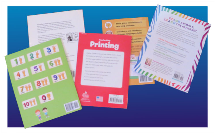 Back cover
As with any book, the back cover is the place to sell the product. Show a few examples of what’s inside, or use words to describe the goals the user will achieve. Or you might even have a couple of testimonials from teachers or relevant experts to place on there. We show multiple examples of back cover designs and what to include in chapter 64 of Book Design Made Simple. And as always, study what your competition has done.
The back cover is your last chance to display the publisher’s name and contact info. You might be placing your copyright notice in the lower left corner. And don’t forget the all-important bar code in the lower right corner.
* * *
With all of this information in mind, you should be able to design a workbook that looks professional and handsome and that functions well.
Read more: Typeface vs. font » will end the confusion once and for all.
Read more: Our list of online font vendors » will help you find just the right typeface for your workbook.
Read more: Design a children’s picture book » could give you good ideas that you can use in your workbook.
Book Design Made Simple. You can do it yourself.


Great tips! This will make workbooks more engaging!