 Hyphenation and justification settings are things you don’t think about until you need to! Book pages often look amateurish using InDesign’s default settings. Justified text can appear too stretched or squished, and hyphens abound. Often, just changing the hyphenation and justification settings instantly puts things right.
The following excerpt from chapter 7, Creating Your Document, explains the hyphenation and justification settings, and how to set them in your Basic Paragraph Style.
Every InDesign document comes with a default Basic Paragraph style. Open your Paragraph Styles panel and you’ll see that your document already includes a paragraph style called Basic Paragraph. The style name is in square brackets because it’s a default style and you don’t have the option of deleting it. You’ll use this style as a basis for all your text and adjust the settings so your type will look great.
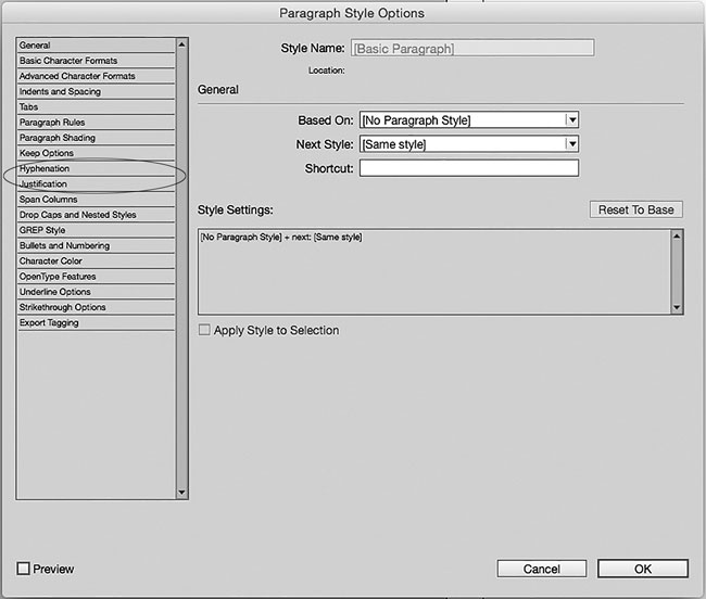
Double-click the Basic Paragraph style in your Paragraph Styles panel, and you’ll see the Paragraph Style Options dialog box:

On the left side of the dialog box are several different categories. The General category is selected in the example shown here. Select the Hyphenation category to adjust hyphenation settings, and select the Justification category to adjust justification settings, as explained below.
InDesign’s hyphenation settings
These hyphenation settings are recommended for justified text. They ensure that:
- there aren’t too many hyphens in a row
- words don’t get broken with just two letters on a line, such as op-era or opi-um
- the last word in a paragraph isn’t hyphenated, leaving part of a word alone on the last line
With these settings, you can be confident that most, if not all, of your paragraphs will have even spacing and not too many hyphens.

It’s a good idea to uncheck the Hyphenate box for all heading styles.
InDesign’s justification settings
When text is justified, InDesign must do its best to make your type look as evenly spaced as possible, a difficult task as every line contains a different number of characters. These settings allow InDesign to add or remove space between words (word spacing) and between letters (letter spacing), and even to make the characters slightly wider or narrower (glyph scaling), in order to make your paragraphs look their best.

The Adobe Paragraph Composer adjusts letter spacing and word spacing to achieve the best look for the paragraph as a whole. The Adobe Single Line Composer adjusts spacing for the best look of each line separately.
We hope that by adjusting your hyphenation and justification settings, the typesetting on your book pages will look great, with no uneven spacing and no stretched or squished lines of text.
Read more: How to fix book typesetting and layout issues in InDesign »
And more: Use optical margin alignment to make your paragraphs look better »
Read still more: Is your image high enough resolution for printing? »
The excerpt above is from Book Design Made Simple, Second Edition, chapter 7, Creating Your Document, pages 35 and 39–40. Copyright © 2017 Fiona Raven and Glenna Collett.
Need more info about book design, InDesign, and publishing? Our website, book, videos, and blog cover every aspect of how to design and publish a book, whether you’re already an experienced book designer or a complete novice. Download chapters 1 through 9 of the book by subscribing to our blog—simply fill in the form below, and click the Join Us! button.
Book Design Made Simple. You can do it yourself.

