 Front covers attract and back covers sell—we’ve said it before. At the same time, a book spine should broadcast.
Most books in stores and libraries are shelved with their spines facing out. If a book has a great title and a well-designed spine, it’ll attract a lot more eyes than its neighbor on the shelf. So here’s how to accomplish that for your book.
What to include on the book spine
The book spine should display the most important information at a glance: author’s last name, title, and publisher or colophon (logo). Normally you don’t include the author’s first name or the book subtitle, though there are always exceptions. Too many words dull the impact.
When the book lies face up on a surface, the spine copy should be right side up. This means that you should arrange the type so it flows down the spine. (In some European countries, it’s done the opposite way, though.)
A spine that’s thinner than 1/4″ cannot hold type because there’s usually a 1/8″ safety area to the left and right of the type. This safety area exists in case your spine slides over to the front or back a bit during binding. How do you know how wide your spine will be? Ask your printer. Most printers will send you a cover or jacket design template to your exact measurements. If not, consult chapter 62 of Book Design Made Simple for guidelines.
A good title
Coming up with a great book title is very important, and it takes some imagination and marketing savvy. We know a good title when we see one, but we’re not experts, so we’ll offer you some helpful articles:
- How to Write the Perfect Book Title [Ultimate Guide] from Scribe Media
- How to Create Good Book Titles from Bookfox
- How to Craft Effective Book Titles (& Subtitles) from Friesenpress
Background color or image
You can design a book spine for a paperback or a dust jacket in two basic ways. Either use it as a space for the front cover to flow over to the back, or make it a distinct piece that divides the front and back designs. Since the main idea is to make the type on the spine as readable as possible, a busy background could completely defeat the purpose. Also, the front and back designs might be different (busy on the front, plain on the back), so the spine is usually the most logical place to make that break.

The skinny slice down the center of the sky and sand image on The Christmas Ship makes a perfect spine background because it allows the viewer to notice the type instead. A slice of the image on Six Steps to College Success, though, would look messy and nonsensical on the spine, so the green background provides a nice, clean space for the type. (Cover designs by Glenna Collett)
In the examples above, the images and colors flow from front to back in a logical way that unifies the designs.
Choosing a color or set of colors for the spine background shouldn’t be too difficult. Assuming that your front and back covers are attractive, simply pick up eye-catching ones from there, or maybe find a contrasting color instead.
Because book binding is automated and not every single spine comes out perfectly centered, it can be smart to wrap a bit of color around from the front and back to the spine, or vice versa, as in the examples below. This way, any imperfections are less noticeable.
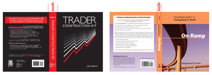
On the left cover, the black background wraps around to the spine. On the right cover, the spine background color wraps around to the front and back. (Trader Construction Kit cover design by Lars Astrom, On-Ramp cover design by Glenna Collett)
Design a book spine for impact
Visibility is your main goal. Make the type as large as you can while staying within the designated type area. The type should contrast with the background to boost visibility, too.
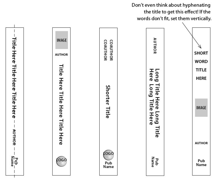
The type on a book spine can be arranged in so many ways! Here’s an illustration from Book Design Made Simple (page 440). Notice that the publisher’s name is always at the bottom in these examples. If your book will be appearing in libraries, the catalog number will be shown on a sticker at the base of the spine—so don’t let the title or author’s name stray down too far.
And here are some real life examples.

Which spines catch your eye first? Probably the ones with the brightest colors and the largest, boldest type, right? But also notice the different ways in which the elements are arranged.
Big. Bold. But still in keeping with the rest of the cover. For the title type, match what you used for the title on the front cover. If you discover that it’s unreadable at a small size, make it bolder or pick a different typeface from somewhere else on the cover.
Designing covers and spines for a book series
Advance planning is the key here. Notice in the books below how the spine elements line up with each other for maximum impact on the shelf. Check out our article on designing a book series in this blog for more advice.

Cover designs by Fiona Raven
For such a small space, the book spine has enormous possibilities. And enormous potential to help sell your book.
We hope this article will get you started designing the spine for your own book with confidence.
Read more: Book binding basics » Learn how books are put together.
And more: Book binding types » Find out about alternative kinds of book spines.
And even more: Creative book cover treatments » Add pizzazz to your cover and spine.
Book Design Made Simple. You can do it yourself.


I HAVE WRITTEN A BOOK SIZED 5.5 X 8.5
I HAVE DESIGNED THE COVERS BUT HAVE NO CLUE TO PREPARE THE SPINE.
I WANT TO POST THE BOOK ON AMAZON. COULD YOU PLEASE ASSIST ME? THANKS.
We’ve written a whole chapter in Book Design Made Simple explaining step by step how to create your book’s spine in InDesign. It’s chapter 65, Designing Your Spine, pages 437-440. If you’re not using InDesign and simply want someone to create a book cover for you using your front and back cover designs, then I suggest finding a graphic designer online to help you. An internet search for “graphic designer to create book cover” will bring up lots of options for finding a suitable freelance graphic designer to work with.
Good luck with your book!
Fiona
This is all new for me, I’ve been struggling on what and where to start with my book, I’ve tried numerous different sites but never understood them fully, I must say this is the best so far with everything explained in detail to a full understanding where you also get images to help you in the correct way it’s definitely 5* as I continue to read and help myself progress
Hi Alyson,
Thanks for your note! We’re excited that you’re finding our book helpful right from the start because we had you and other complete beginners in mind when we wrote it. If you run into any problems with your project, please let us know.
Glenna and Fiona
Excellent. I never really paid much attention to why the publisher name/logo is typically placed at the bottom of the spine.