 In early November, we all woke up to find Adobe Creative Cloud waiting to be updated. What—again? Well, it turns out that this update, CC 2017, does provide some InDesign enhancements that might help you work more effectively and improve your design. We’ll discuss the significant ones here.
Blue highlighting
This feature appeared earlier in the fall, and perhaps it’s been driving you crazy, so we’ll address it first. It’s the bright blue highlighting you might be seeing in your text and/or to the left of your text frame. Blue highlighting on the type itself indicates places where you’ve applied local formatting (i.e., deviated from your paragraph style), perhaps with baseline shift, tracking, a different font, or an improperly applied character style. Blue marks outside the left edge of your text frame also indicate deviations from a paragraph style. (Note: If you’d prefer to see this in video format, watch our premiere YouTube channel offering, InDesign Text Highlighting.)
Don’t worry—you’re not the first to be driven mad in your attempts to get rid of the blue. Adobe has sneaked in a little icon that you probably haven’t noticed in your Character Styles and Paragraph Styles panels: a small “[+].” Deselect all type, then click on the icon a couple of times to watch all the blue disappear and reappear. Now that you’ve tried it and know what’s going on, you can choose to turn the highlighting on or off anytime.

If at some point you need to find all instances of style overrides (before making a PDF for a printer, or converting to an ebook, for instance), remember this highlighter. It could save you lots of time and headaches.
By the way, are you wondering about other colors of highlighting that show up in your document? (Sometimes when you get rid of some blue highlighting, it simply turns to another color!) If so, go to Preferences (File > Preferences on a PC, or CC InDesign > Preferences on a Mac), then in the Composition dialog box, see what you’ve checked in the Highlight area. Adobe doesn’t tell you this, but here are the colors for the most common categories:

Mystery solved!
OpenType features
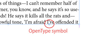
The first thing you might notice when you place type in a new InDesign document now is a small “O” near the lower right corner of just about any text frame. That “O” looks a bit familiar, right? That’s because it’s the OpenType symbol that you see whenever you look at the font dropdown list in the Control panel.

If you click on the symbol with the Selection tool, you’ll immediately see a menu of several OpenType enhancements, or stylistic sets, that are available for the type in that text frame. If you select an option, the enhancement will be applied everywhere in that text frame, highlighted. Wow! Some of the features might look wonderful, but most are probably neither appropriate nor appealing. Below is an example of a poor selection for text type:

To universally apply a useful feature that you’ve discovered, simply go to the relevant paragraph style and add it in the OpenType area of the style, as shown below.

But please don’t overdo it. We’re guessing that a maximum of one of the more fanciful contextual OpenType enhancements will be enough in the pages of your book. For your front cover, though, you might discover some interesting possibilities.
Along with the new handy method above for adding OpenType enhancements, you will also sometimes notice a pop-up showing stylistic sets available for the type you are setting or selecting. For instance, you might see a pop-up suggesting a fraction as you type “4/12.” Converting to a fraction this way will definitely save you time.
You can get rid of the “O” icon altogether by going to Preferences > Advanced Type, and unchecking the two boxes in the Type Contextual Controls category.
Footnotes
In chapter 50 of Book Design Made Simple, we discuss how to set up footnotes so they automatically fall at the bottom of the correct pages or columns. Now, since the InDesign update, if you are working with more than one column on a page or in a sidebar, you can choose whether the footnotes should stay in the individual columns or span the width of all of the columns. To span the width of all columns, simply select the new Span Footnotes Across Columns option at the top of the Layout tab (Type > Document Footnote Options > Layout). See below.

Arrowhead size control
Finally! You can now control the size of the arrowheads and shapes at both ends of lines. In Book Design Made Simple, we used lots and lots of arrows with our illustrations, and perhaps your book has arrows, too. You can easily refine them now to suit your taste. (We discuss the drawing tools in chapter 34, or you can watch our short YouTube video Scaling Arrowheads in InDesign.)
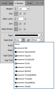
Simply draw a line, select it, and open the Stroke panel. Notice the new Scale and Align options at the bottom of the panel:

Choose an arrowhead or shape for the start and end of your line (see the list of options below).

Then scale both ends. Here are a few examples:

Once you settle on something you like, remember to make an Object style of it (page 276), or put it into a library (page 278)—whichever works for you.
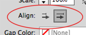
In the Align area of the Stroke panel, you can choose whether to allow the arrowhead to stick out beyond the ends of the line you drew (left), or to keep it within the length of the line you drew (right).

Control panel customization
Boy, that Control panel sure has a lot of information. As one of our readers said, it looks like the dashboard of a Boeing 747. Do you use it all the time, as we do, or ignore it? Well, you’ve always been able to customize the Control panel so it shows only the functions you’re interested in, but now it’s easier to find the customization options.

Simply click on the new little gear icon in the upper right corner of the panel, and you’ll see a dialog box like the one below. Choose the features you want to see and those you don’t. You can change your mind any time.

We hope this short review of some of the new features of InDesign CC 2017 has been helpful. Be sure to subscribe to InDesign Secrets. It’s free, informative, and will keep you up to date on all things InDesign.
Book Design Made Simple. You can do it yourself.


Thank you for once again providing a really helpful post! Adobe Indesign can certainly be intimidating for novices, so any additional information is always welcomed! We’re thinking that your explanations about the changes regarding footnotes and the arrowhead sizes/shapes will be particularly handy for our current project as both aspects will come up often. Thanks again and we look forward to future posts!
Thanks, Lyle. You are our biggest fan! We’re glad we’re helping people with our jottings.
Glenna