
In my previous blog post, I mentioned mixing two colors to use for 2-color printing. So now I’m back to explain how to do that in InDesign, plus how to make a 2-color photo (duotone) in Photoshop. And I’ll let you in on the simple way to make a fake duotone right in InDesign, too.
So let’s start with what we can do in InDesign.
Mixing inks in InDesign for 2-color printing
As I mentioned last month, 2-color printing is becoming a rarity for books because it’s only practical on an offset press. But it’s still an excellent way to add color to a book while saving on printing costs. So if you’re going to do it, you might as well squeeze as much out of your two inks as you can.
In this blog post, we’ll use the most common first color: black. For our second color, let’s use PANTONE 109, a golden yellow. It may seem an odd choice, but you’ll see its usefulness as we move along. Here’s how to mix the colors in your document:
- First, add your PANTONE (PMS) color in the Swatches palette (Swatches > New Color Swatch). In the Color Type drop down menu, choose Spot.
- Now use the Color Mode drop-down list to choose your ink. In the example below, I have picked PANTONE solid uncoated, the most common type of ink used for 2-color printing in the interior of a book. (If you are unsure, ask your printer; chances are they will recommend this as well.)

- In your Swatches panel you will now see the PMS color added. (The U next to the number indicates that it’s an uncoated color—in other words, it will print on uncoated paper. The little icon (circled in red below) indicates that it’s a spot color.

Next you can add some mixed colors. This is the fun part!
- Go to Swatches > New Mixed Ink Swatch. Select the two colors you plan to mix, which in this case are Process Black and PANTONE 109 U. Then use the sliders to mix the inks. Click OK when you find a combination you like.

- Repeat the step above until you have a range of mixed ink swatches that you think you can use. Your Swatches panel will now look something like this:

- And you will do well to print a page of color swatches to refer to (and to show to your client), like this:

Now that’s a lot of colors! You can use the darker mixed colors for headings and display type, the lighter ones (mixed or not) for backgrounds, and the yellows for your duotones.
Next, since we are already using InDesign, I will show you how to make a fake duotone.
Making a fake duotone in InDesign
Just because it’s fake doesn’t mean it’s no good. As long as you understand what you’re doing (read on), and you’re using the fake one on purpose, you’ve got my permission to go for it.
So what is a duotone, anyway? It’s a photo that started out as black and white (grayscale) but now with a second ink added. Below are three versions of the same photo: grayscale, a real duotone, and a fake duotone. The differences are pretty obvious, right?

Left to right: grayscale, duotone, and fake duotone
The real duotone uses the second color (PMS 109 in this case) throughout the photo in the same proportions as the black—dark areas use more yellow and light areas use less. The fake one has a uniform yellow background (solid yellow in this case, but you can use a lighter tint) that affects the lighter areas more than the darker ones.
So here are the simple steps for making the fake duotone in InDesign:
- Place a grayscale photo (File > Place) in your document.
- Select the photo with the Selection (black arrow) Tool, open the Swatches panel, and choose your spot color as the fill. Use the solid swatch or one of your screened swatches.
- And you’re done!
How easy was that?
Making a real duotone is a bit more involved, but well worth the extra effort.
Making a real duotone in Photoshop
Now for the real thing. Duotones are often used to make a photo look old or historical, and warm colors are the best at lending the look of old age, so that is one reason for choosing PMS 109 as our second color. Here are the steps to use in Photoshop:
- Open an image in Photoshop and make sure it is grayscale (Image > Mode > Grayscale, or Edit > Convert to Profile using your printer’s preferences—see page 309 of Book Design Made Simple).
- Go to the Image menu and choose Mode > Duotone, as shown below.

- In the Duotone Options dialog box, choose Duotone as the Type.
- Click on the color sample that is not black (usually this is the Ink 2 box), and the Color Libraries dialog box will appear.
- Choose a second color from the Book drop-down list as shown below—“Book” is equivalent to “Color Mode” in the InDesign New Color Swatch panel. Make sure the color name and number exactly match the spot color you’re using in InDesign.

- Next you get to play with the curves. Unless you’re a Photoshop expert, you should probably leave the black curve alone—it’s a diagonal line from lower left to upper right.

- But you can change the curve of your second color, as shown below. In the Duotone Options dialog box, check the Preview box. Click on the curve (left) box next to Ink 2.
- When the Duotone Curve box appears, you can move the ends and/or center parts of the curve, and watch your photo change. Altering the curve increases or decreases the amount of second color ink in dark or light areas of the grayscale image. When you’re satisfied, click OK.

- Note that if you switch the order of the inks, you’ll change the way the duotone looks (see below). In this case, Black would become Ink 2. For the photo we’re working with, the yellow would become dominant and black would be the accent color. To do this, click on the color block next to Ink 1, then use the Color Libraries dialog box, as before, to find the color you want. Then repeat with Ink 2.

In the left example, black is Ink 1. In the right example, black is Ink 2.
- If you want to change anything about the duotone you just made, go back to Image > Mode > Duotone, and redo the appropriate steps.
- Save the photo in one of three ways: (1) Photoshop (.psd) format, (2) Photoshop EPS (.eps) format, or (3) Photoshop PDF. For the PDF format, it is fine to use the Smallest File Size Preset. All of these formats will work in your InDesign document.
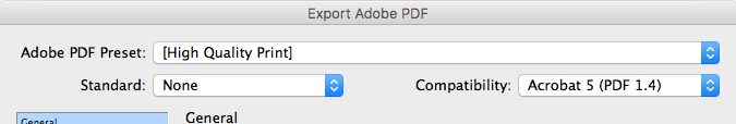
Exporting from InDesign to PDF for 2-color printing
When it comes time to make a PDF of your InDesign document for 2-color printing, you’ll probably find that the Smallest File Size Adobe PDF Preset doesn’t support any mixed inks and displays them in grayscale. To avoid this problem, simply use the High Quality Print or Press Quality preset, as shown below. If your book printer requires special Acrobat settings, of course you should use those.
Even though two-color printing and duotones have been a bit neglected lately with all the excitement over print on demand and digital printing, I do hope that some of you are printing offset so you can enter the attractive, useful, and cost-effective realm of 2-color printing.
Read our earlier post: Devising a color palette for your book »
Read more: Converting multiple images to CMYK in Photoshop »
Read even more: Color gradients – tips for best results »
Book Design Made Simple. You can do it yourself.


Great article! Duotone design is a great way to bring out details in your prints. Thanks
We’re glad you enjoyed the article, Mike. Duotones are almost a lost art with all the digital printing going on these days.
Glenna
Hi. Great article.
I’ve been looking for years to find a way of converting a CMYK image to an approximation using 2 inks. My aim is to create a colour image which doesn’t immediately feel like a duotone.
Say I have a snowy mountain CMYK image, with mostly shades oranges and blues. I know I can achieve a dark brown and a dark green-cyan by overprinting with different density combinations of a rich orange a rich blue ink, so achieving some contrast shouldn’t be difficult.
My question is, how do I convert from CMYK to “OB”, and create two separation plates for these two inks, starting with my CMYK image? Maybe it’s simple, but I seem to be stuck.
M
Hi Marcus,
Fiona and I discussed your question. We are assuming that by “OB” you mean orange and blue. We also assume that you are going to prepare this for printing on an offset press, where you can use Pantone inks.
All you have to do, really, if you’re following along with the Photoshop instructions in the blog post, is make one of the colors a Pantone blue and the other one a Pantone orange, and don’t use black at all in your photo. (Or, if you’re printing offset in CMYK plus 2 Pantone colors, you can make a tritone with orange, blue, and black by using the same method, but it would be trickier to print.) Simply play with the curves in your two (or 3) colors. And also try reversing which color is first and which is second. It’s all explained in the article.
If this doesn’t answer your question, please write to us again and we’ll try to make it more clear.
Best of luck with this. We’d love to see the result when you’re finished with your image.
Glenna
This was super useful for me as i had to convert a four colour design work into a two colour one. Just love the possibilities you have opened up.
many thanks
Hello Rhoda,
We’re glad you found our article and that it helped! I love 2-color printing and wish that more people knew about it. Have fun with it!
Glenna
Yes .. did have fun, especially giving the mixed ink colours different names as per my choice !!!!
But a glitch with the printer now 🙁 they say that mixed inks such as 40black and 60pms 109U on map litho paper may nor render well at all. the black may bleed extra than the yellow … is this right ?
Hi again Rhoda,
Sometimes issues do occur on press, and sometimes it’s the paper that’s the problem. If you’ve ordered a large run, then changing the paper stock is probably not possible. Please work with your printer to find a solution to this by offering different ink combinations that might work better. For instance, see if 30 black 60 PMS 109 would help. Ask for samples, too. If you are close by, perhaps you could visit and work something out together.
I do hope you find a good solution.
Glenna
Thank you very much for your prompt response Glenna. Really appreciate your help .. and the content you share in your site generously
I really hope it works out for you, Rhoda!
Glenna
That was my thought re 2 screens: duotone is a great way to get better detail from a black and white image.
Hello Dana,
Thanks for that thought. It really is true about getting more detail from a grayscale image. I should have mentioned it in the article.
Glenna
Another excellent tutorial on a little-discussed topic, thanks. I could quibble with:
“The real duotone uses the second color (PMS 109 in this case) throughout the photo in the same proportions as the black”
since the second color in many duotones usually has a very different density curve than the black image, but I’d rather thank you for the effort that went into this article.
Hi Joel,
Of course you’re correct about the color density, and I realize now that I could have also explained how the two screens line up and work on the press, the point is, as always, to keep things simple for folks. We want them to try the technique and worry about the nitty gritty later. Thanks for your comments!
Glenna